


Econosights
Perceptions Vs Reality: Australia Is Rich – So Why Doesn’t It Feel That Way?
“You don’t appreciate how much stuff you have until you move.” Maybe Australia is the same. Perhaps we need to step back and appreciate how good we already have it.
12 min read

Introduction
After the release of the Australian 2026-27 Federal Budget, frustration across the political spectrum seemed to hit fever pitch. There was real unhappiness about policy changes and the implications for the direction of the economy. The level of apparent discontent got me a little worried. Sure, there are parts of the economy that could be stronger and there were things we wanted to see in the Budget that weren’t there. However, on most measures from a macroeconomic point of view, Australia is doing quite well and we continue to live in the “Lucky Country”.
This made me think of something my dad said when we were moving house: “You don’t appreciate how much stuff you have until you move.” Maybe Australia is the same. Perhaps we need to step back and appreciate how good we already have it.
The key metrics – Australia vs the rest of the world
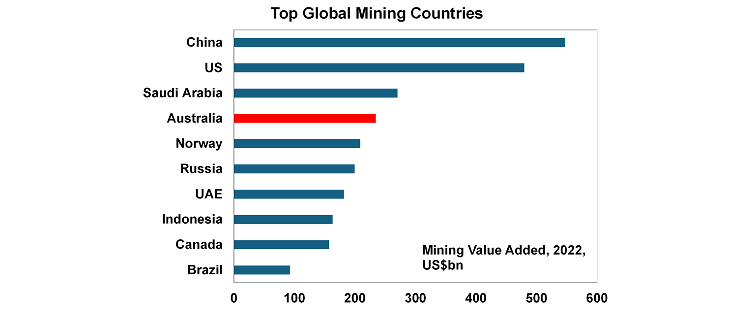
We know that Australia dominates as a global resource powerhouse and it is the 4th largest mining country (by gross value added) in the world (see the chart below).
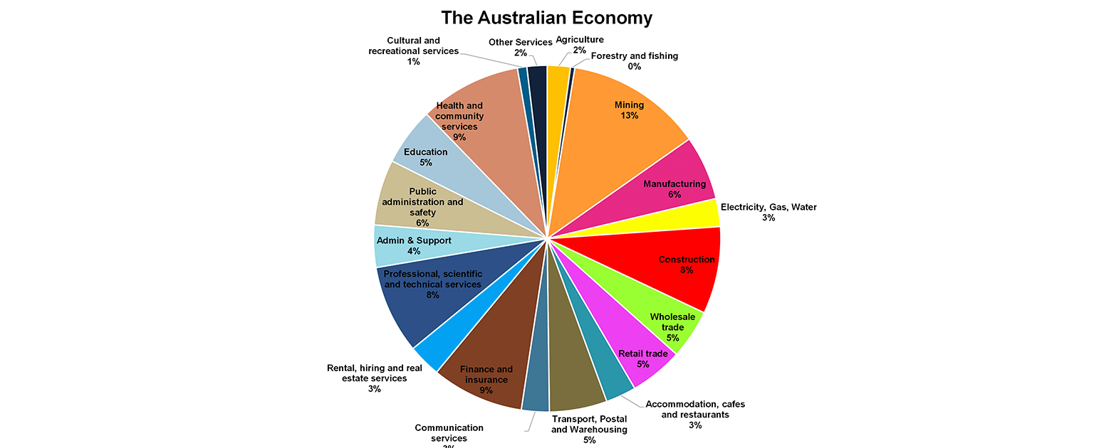
But what else is driving the economy? Besides mining (at 13% of GDP), the other large sectors are finance and insurance (9%), healthcare and social services (9%), professional services (8%) and construction (8%). Despite being seen as a major resource exporter, we don’t sell much “stuff” to the world – we’re overwhelmingly a services economy (at about 2/3 of value added).
To make sense of how Australia is performing, we need to compare ourselves to similar economies. That’s why we typically benchmark against other advanced OECD countries - developed economies with comparable institutions, governance frameworks and income levels.
Let’s start with the facts. The best way to do that is by looking at standardised measures of economic performance as a guide to prosperity and living standards.
Gross domestic production (or GDP), which is the value of a country’s production
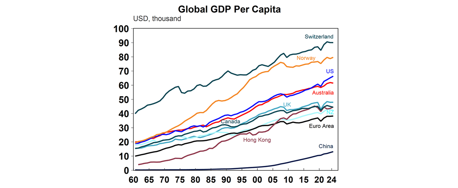
The best way to compare countries globally is using GDP per capita (or per person), adjusted for currency. Larger populations naturally have larger economies, so this measure allows for a fair comparison. On this basis, Australia ranks highly, with GDP per capita of around US$61k. That puts us above the Euro Area, the UK and Canada, slightly below the US (US$66k), and behind Norway (US$80k) - another major resource economy.
The GDP critics will say that high production doesn’t automatically mean households benefit. How much of that income actually flows through to consumers?
Household income measures how consumer benefit from GDP/
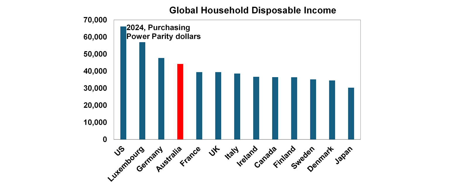
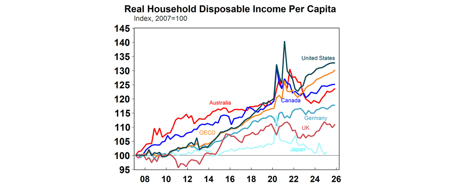
On this measure, Australia also performs well. Gross disposable income - adjusted for purchasing power (which accounts for differences in currency, inflation and cost of living) - was around US$44k per person in 2024. That’s above most European economies and Canada, although still well below the US at around US$66k.
The challenge more recently has been inflation. Higher relative inflation in Australia has meant that real household incomes have grown more slowly over the past six years (see chart below). While income levels remain solid, growth has lagged behind peers.
What about debt?
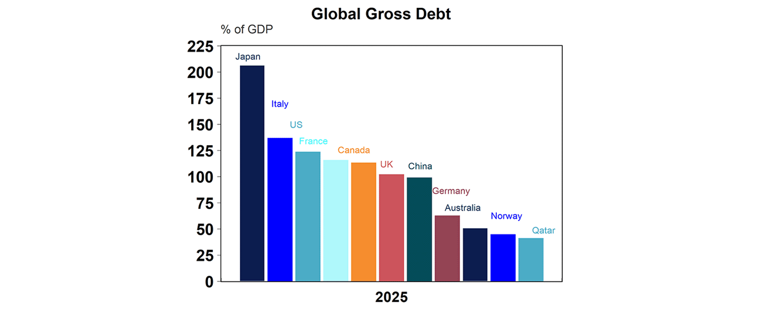
A lot is made of Australia’s “$1 trillion” government debt. It sounds alarming. And it’s often framed as a burden on future generations or a constraint in a crisis.
That framing misses the point. Debt will naturally grow over time with inflation and as the economy expands. What matters is not the level of debt in isolation, but its size relative to the economy - and the cost of servicing it.
On that basis, Australia actually looks relatively well placed. Gross public debt is around 34% of GDP, which sits at the lower end of the global spectrum (see chart below). Lower relative debt levels have been helped by windfall revenues for the government from resource companies as a result of high commodity prices.
Then what about household debt?
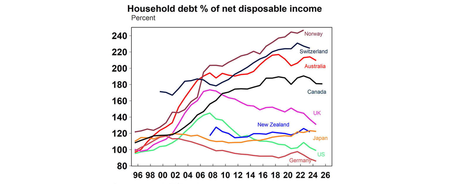
Household debt is often raised as a concern - and rightly so. Australia has one of the highest levels in the world, driven largely by elevated housing prices and a strong preference for home ownership, both for living and investment.
Household debt sits at around 210% of income, higher than Canada, the UK, New Zealand, Japan and the US - although still below some countries like Norway and Switzerland.
High debt levels do increase vulnerability. Households are more exposed to rising interest rates, which lift repayment costs, and to economic downturns, where job losses can make servicing debt more difficult.
That said, household debt has stabilised in recent years, and households have been relatively resilient through the period of rapid interest rate rises following the pandemic.
The other side of the debt equation is assets - and to assess the net position, we turn to household wealth.
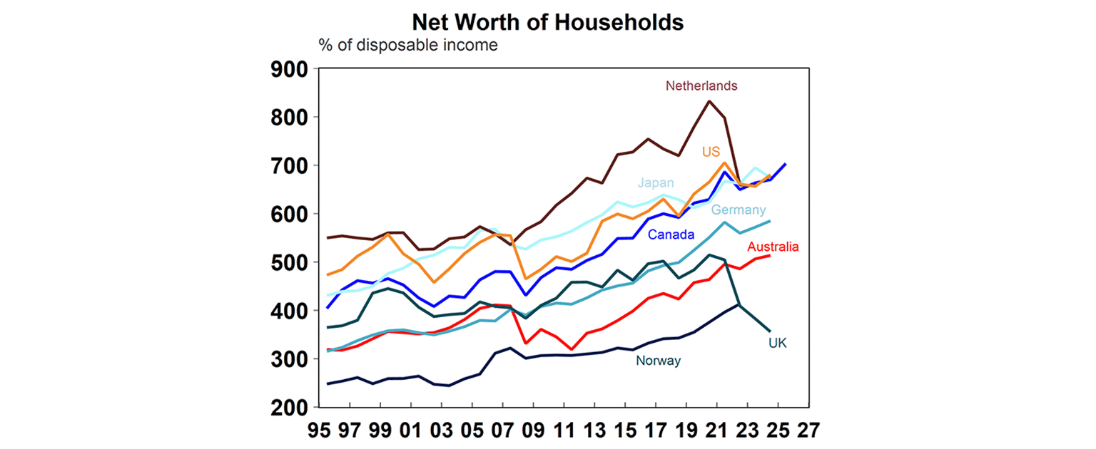
But high debt needs to be seen in context. Large stockpiles of wealth - the difference between assets and liabilities - provide a buffer.
On this measure, Australia looks strong, with household wealth at around 513% of income. That said, it still trails peers such as Canada and the US, where the ratio is closer to 700%.
What about how income and wealth is distributed across the population?
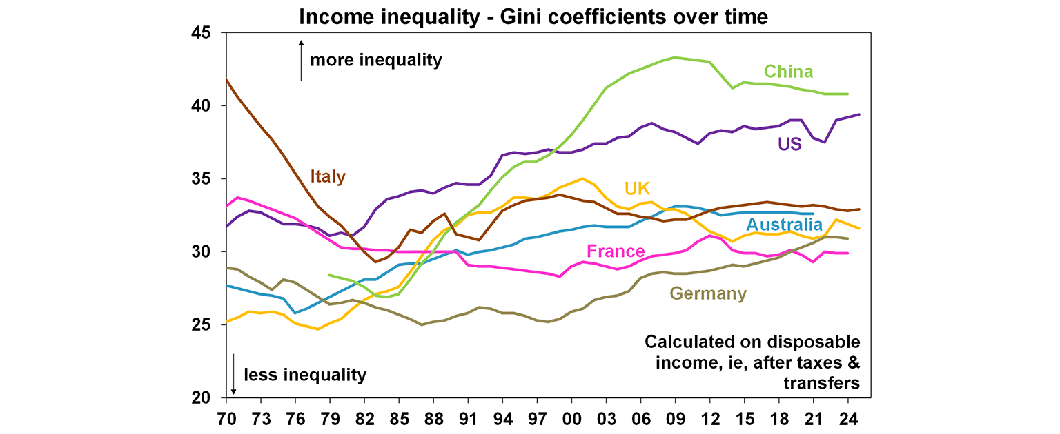
Inequality is typically measured using the Gini coefficient - a statistic based on ranking individuals from poorest to richest. It ranges from 0 (perfect equality) to 100 (complete inequality).
On this measure, Australia sits at around 32.6, which has gradually increased since the 1970s - indicating a rise in inequality over time. Even so, it remains lower than in countries like the US.
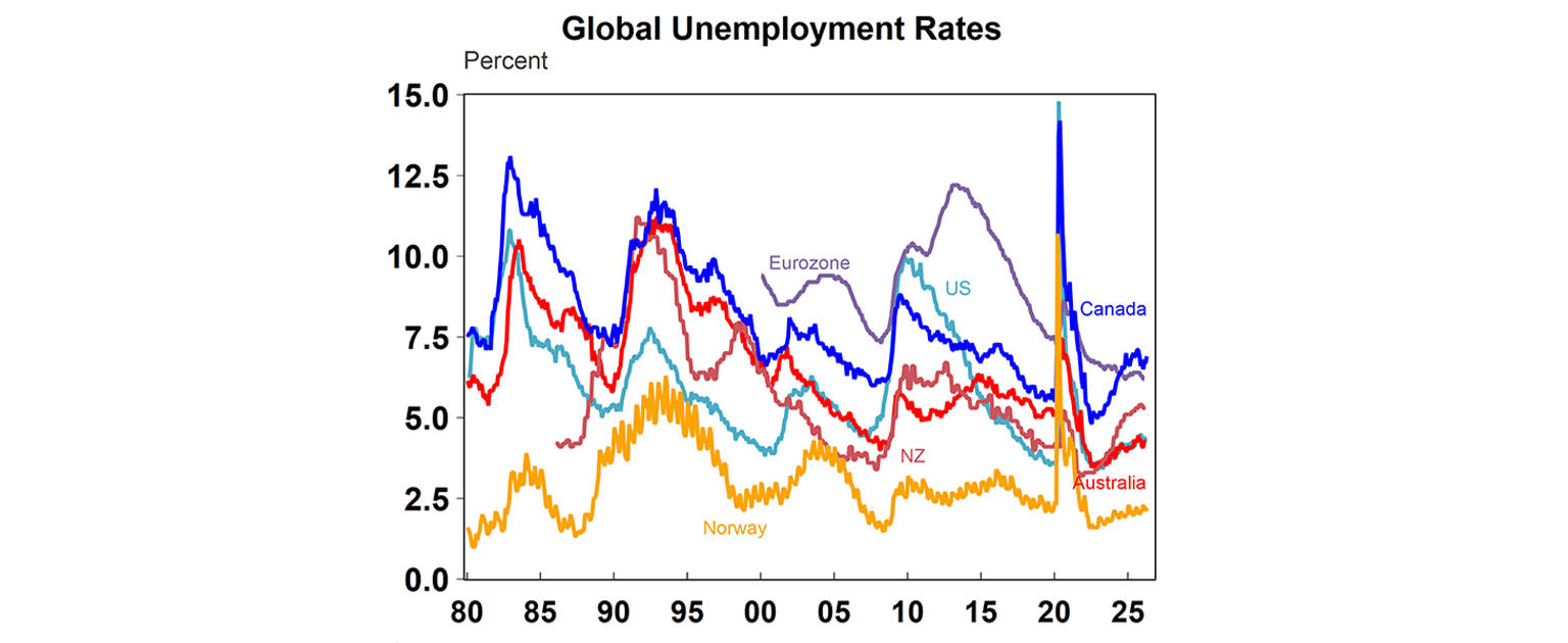
Australia’s success in keeping employment high and unemployment low during the period of rising rates and slow growth is a big success story. The unemployment rate still remains near a 50-year low while unemployment in most other countries is back up again to pre-pandemic levels.
And ultimately what about happiness?
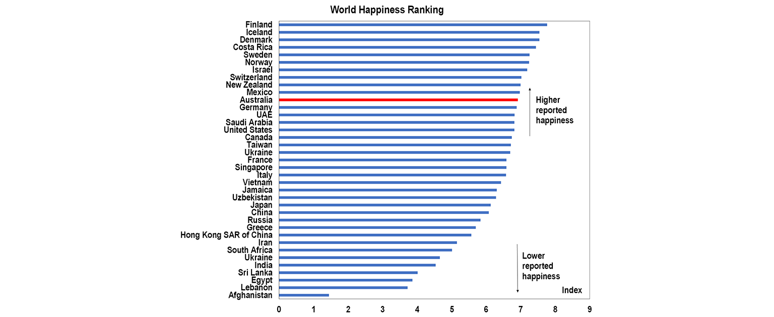
Australia’s happiness ranking based on the World Happiness Report shows relatively good happiness and life evaluation scores. Scandinavian countries continue to outperform happiness rankings, which is a long-term structural theme based on strong welfare systems, high job security and perceptions of a fair and predictable society.
Based on these measures of living standards, Australia generally comes out relatively well - a country with strong fundamentals and solid long-term prospects.
So why are Australians complaining?
Given Australia’s relatively strong economic performance over many years - not just recently - it’s somewhat surprising that sentiment feels so negative here.
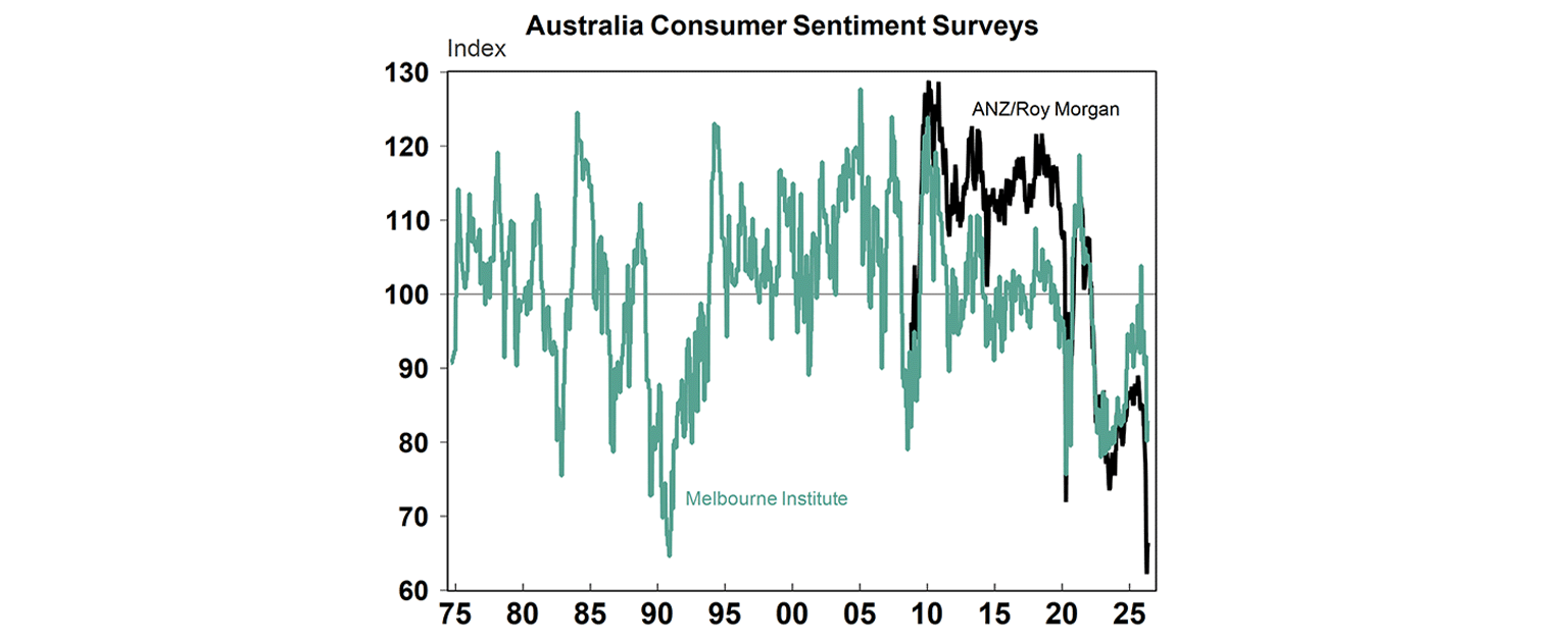
You can see this in both anecdote and data. The public conversation often feels pessimistic, and consumer sentiment surveys show households are deeply downbeat (see chart below) - at levels typically associated with recession, despite the fact that Australia has largely avoided them. Before the pandemic, Australia’s last recession was in the early 1990s. Have Australians become so used to the “good times” that we don’t even remember what hard economic periods are like?
Maybe it’s a broader frustration with politics and institutions, reflected in shifts in voting patterns, like the recent rise in support for One Nation. Yet it also raises a bigger question: what happened to the idea of Australia as an easy‑going, optimistic country?
The reality is that Australia remains a high-quality economy, with strong institutions, a stable financial system and relatively moderate policy settings. Perhaps the issue isn’t just the economy itself - but how we perceive it.
Diana Mousina
Deputy Chief Economist, AMP
You may also like
-

Weekly market update - 17-07-2026 Pressure remained on Korean shares which are down 25% from their high on worries about a bubble, profit taking after shares more than doubled, heavily leveraged retail investors closing positions, tightened regulations around buying singe stock leveraged ETFs and not helped by the Bank of Korea raising rates with more hikes likely. -

Oliver's insights - Why have Australian living standards “fallen” and how do we fix it? For the last few years there has been much talk of a “cost-of-living” crisis in Australia and of “falling living standards”. This has flared up again lately with the pickup in inflation resulting in a renewed fall in real wages. -

Weekly market update - 10-07-2026 Ceasefire over but markets are also over the war, Why oil prices can't go too low or too high, Is AI adding to inflation risk or taking it away, and Australia’s wage problem.
Important information
Any advice and information is provided by AWM Services Pty Ltd ABN 15 139 353 496, AFSL No. 366121 (AWM Services) and is general in nature. It hasn’t taken your financial or personal circumstances into account. Taxation issues are complex. You should seek professional advice before deciding to act on any information in this article.
It’s important to consider your particular circumstances and read the relevant Product Disclosure Statement, Target Market Determination or Terms and Conditions, available from AMP at amp.com.au, or by calling 131 267, before deciding what’s right for you. The super coaching session is a super health check and is provided by AWM Services and is general advice only. It does not consider your personal circumstances.
You can read our Financial Services Guide online for information about our services, including the fees and other benefits that AMP companies and their representatives may receive in relation to products and services provided to you. You can also ask us for a hardcopy. All information on this website is subject to change without notice. AWM Services is part of the AMP group.